
Public Health Dashboard: COVID-19 Data Visualization
Interactive business intelligence platform built with Tableau for pandemic monitoring and epidemiological pattern analysis.
View ProjectThis epidemiological case study applies data science methodologies to COVID-19 infection and mortality data. The objective is to develop predictive insights into viral spread patterns and demographic trends to support evidence-based public health policy decisions. Raw datasets are transformed through SQL data engineering, then visualized using business intelligence tools to enable data-driven pandemic response strategies.
https://ourworldindata.org/covid-deaths
Wrote a query to calculate the death percentage on the global scale by summing up all the 'new cases' column and 'new deaths' column from the entire world and then calculating the percentage of deaths from the cases. I specified WHERE continent IS NOT NULL because every country belongs to a continent, So by specifying WHERE continent IS NOT NULL will ensure that only the rows for the countries that have a continent specified will be included in the final results. This will give accurate results for the death percentage on the global scale as it will not consider the rows where the continent is not specified.
--1. compare the overall deaths to cases ratio for the entire world
SELECT
  SUM(new_cases) as total_cases,
  SUM(new_deaths) as total_deaths,
  (SUM(new_deaths)/SUM(new_cases))*100 AS death_percentage
FROM
  `sql-portfolio-project-375703.Portfolio_Project.Covid Deaths `
WHERE
  continent IS NOT NULL
ORDER BY
  1,2
Wrote a query to pull the total death count for each continent while filtering out specific values in the 'location' column ('income'(upper, middle, lower class), 'World', 'European Union' and 'International') that is displayed in the 'location' column. This query gives the total death count for continents and makes sure that the rows with 'income'(upper, middle, lower class), 'World', 'European Union' and 'International' are not considered in the final results.
--2. Pull the 'total_death_count' for each continent in the location column while filtering out the income (upper, middle, lower class), World, European Union, and International rows that's displayed in the location column
SELECT
 location,
 SUM(new_deaths) AS total_death_count
FROM
 `sql-portfolio-project-375703.Portfolio_Project.Covid Deaths `
WHERE
 continent IS NULL AND
 location NOT LIKE '%income%' AND
 location NOT LIKE '%World%' AND
 location NOT LIKE '%European Union%' AND
 location NOT LIKE '%International%'
GROUP BY
 location
ORDER BY
 total_death_count DESC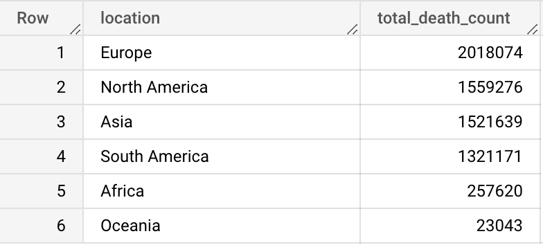
Wrote a query to pull the data for the countries with the highest infection rate per population. I then computed the infection percent per population by dividing the total cases by population and multiplying the result by 100. It filters the rows where the location contains 'income' and groups the results by location and population and orders the results by the highest infection percent per population.
--3. Countries with highest infection rate per population
SELECT
 location,
 population,
 MAX(total_cases) AS highest_infection_count,
 MAX((total_cases/population)) * 100 AS infection_percent_per_population
FROM
 `sql-portfolio-project-375703.Portfolio_Project.Covid Deaths `
WHERE
 location NOT LIKE '%income%'
GROUP BY
 location,
 population
ORDER BY
 infection_percent_per_population DESC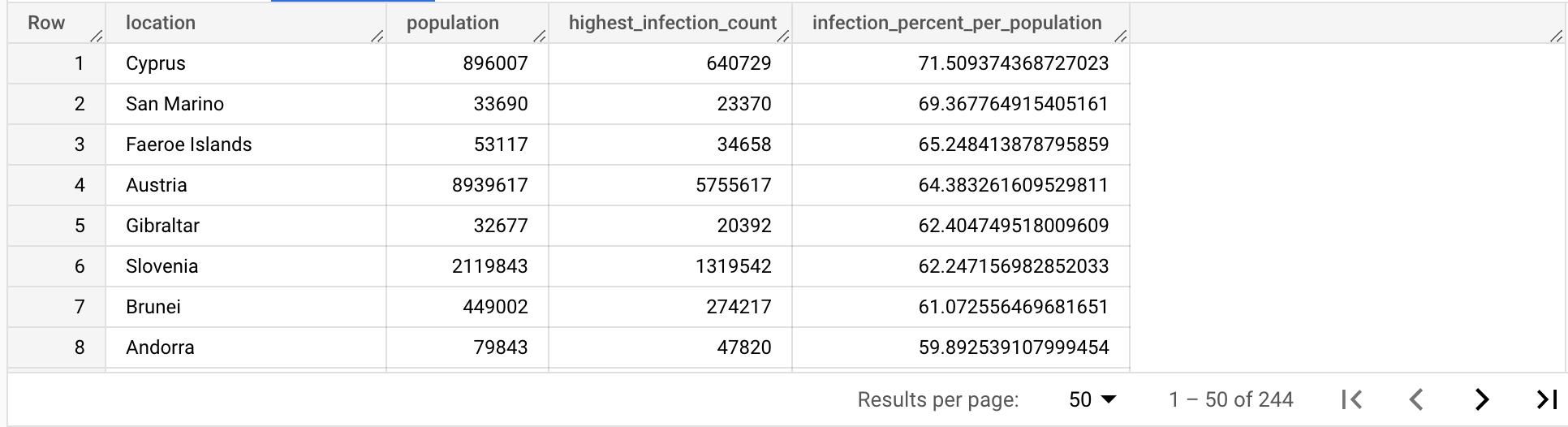
This last query is similiar to the previous one but it also includes the 'date' column in the SELECT statement and in the GROUP BY clause. It is pulling the data for the countries with the highest infection rate per population grouped by date. It is computing the infection percent per population by dividing the total cases by population and multiplying the result by 100. It filters the rows where the location contains 'income' and groups the results by location, population, and date and orders the results by the highest infection percent per population.
--4. Countries with highest infection rate per population grouped by date
SELECT
 location,
 population,
 date,
 MAX(total_cases) AS highest_infection_count,
 MAX((total_cases/population)) * 100 AS infection_percent_per_population
FROM
 `sql-portfolio-project-375703.Portfolio_Project.Covid Deaths `
WHERE
 location NOT LIKE '%income%'
GROUP BY
 location,
 population,
 date
ORDER BY
 infection_percent_per_population DESC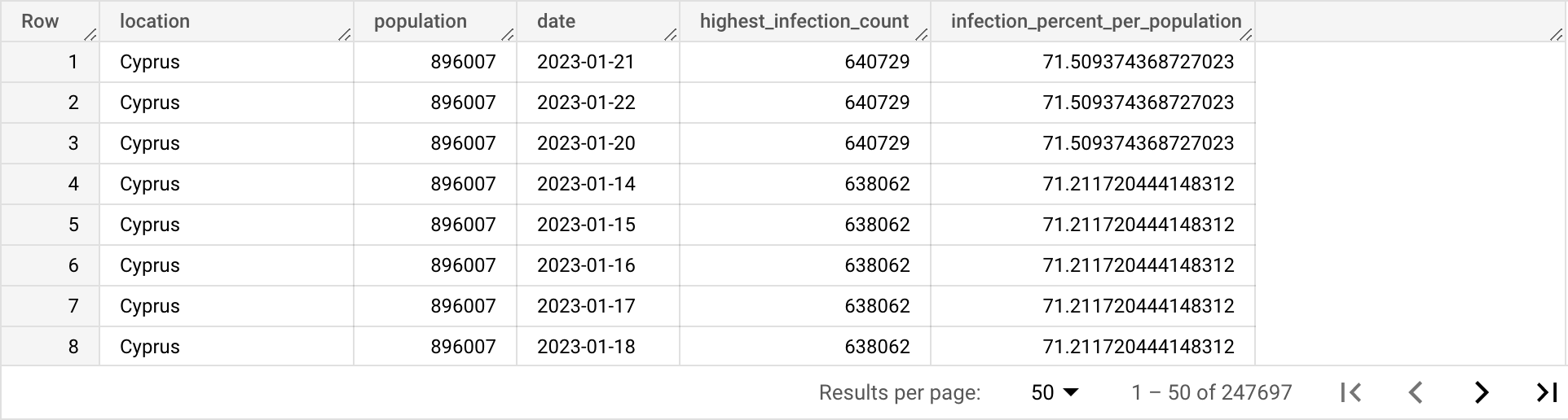
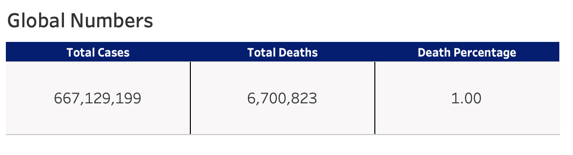
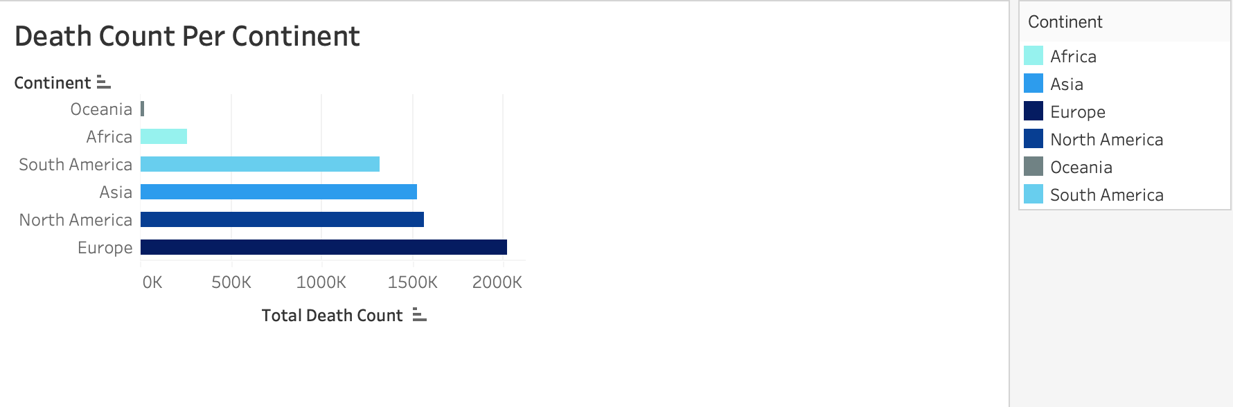
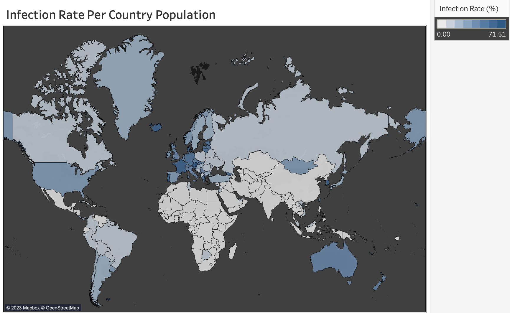
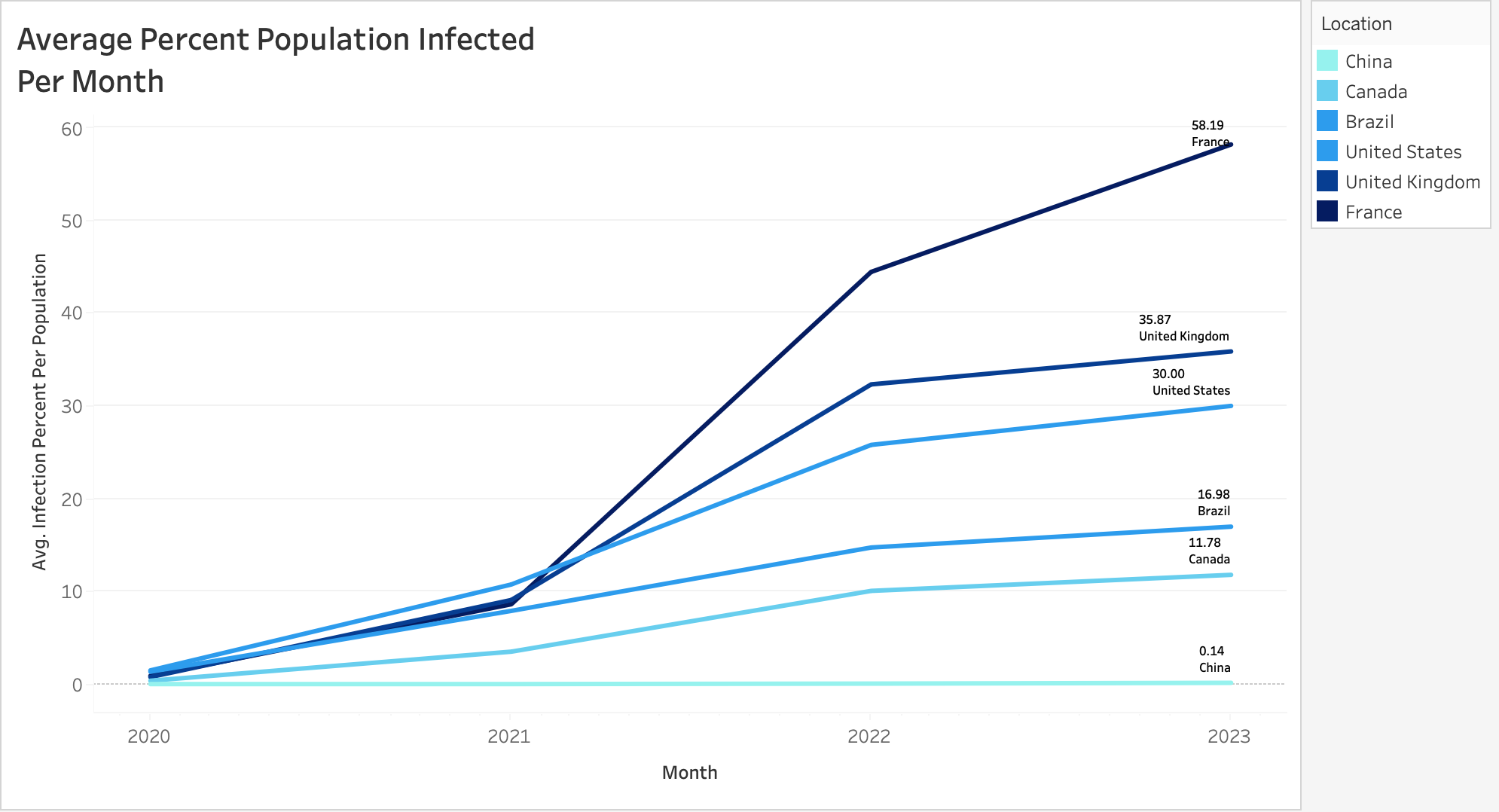
Critical epidemiological insights from this data science analysis (as of January 2023) reveal that approximately 1% of the global population infected with COVID-19 succumbed to the virus, with Europe demonstrating the highest infection rates and mortality burden worldwide. These findings enable evidence-based decision-making for public health policymakers and healthcare systems. The analytical framework remains scalable for ongoing pandemic monitoring and response optimization, demonstrating the power of data science in transforming health data into life-saving intelligence.
Based on the data findings vizualized by the Tableau Dashboard, here are 5 solutions that can be proposed to address the COVID-19 pandemic:
Explore more data science projects demonstrating end-to-end analytical workflows and advanced visualization techniques.
Interactive business intelligence platform built with Tableau for pandemic monitoring and epidemiological pattern analysis.
View Project
Complete end-to-end data science project developing customer churn prediction models with advanced feature engineering and Random Forest optimization.
View Project