
COVID-19 Data Science Analytics
Comprehensive SQL-based data exploration and cleaning project using Google BigQuery for epidemiological analysis and insights.
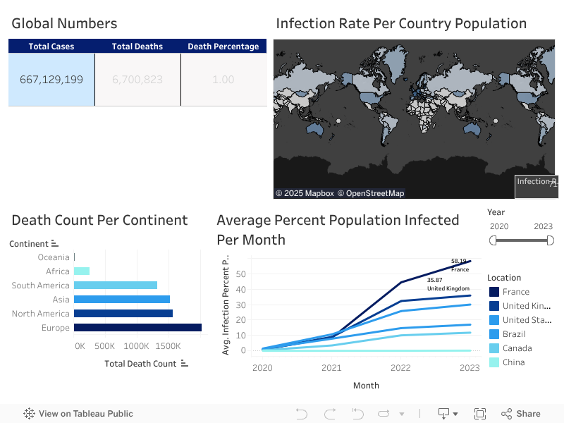
View ProjectThis business intelligence dashboard transforms epidemiological data into actionable public health insights using Tableau. Built on SQL-engineered datasets from Google BigQuery, the platform enables real-time pandemic monitoring with interactive filtering, regional drill-down capabilities, and comparative analytics across countries and continents to support evidence-based crisis response and policy decision-making.
This data science initiative transforms complex epidemiological datasets into interactive business intelligence platforms. Leveraging SQL data engineering pipelines with Google BigQuery, the Tableau dashboard provides comprehensive pandemic analytics including infection rates, mortality tracking, and demographic comparisons. Key insights reveal Europe's disproportionate burden with the highest global infection and mortality rates (January 2023 data), demonstrating the power of data science in crisis response and public health decision support.
https://ourworldindata.org/covid-deaths
Explore more data science projects demonstrating end-to-end analytical workflows and advanced visualization techniques.
Comprehensive SQL-based data exploration and cleaning project using Google BigQuery for epidemiological analysis and insights.
View Project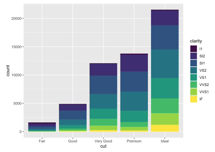
Comprehensive statistical visualization framework demonstrating advanced R programming and ggplot2 techniques for publication-quality graphics.
View Project