
BCG Customer Churn Analysis
Complete end-to-end data science project developing customer churn prediction models with advanced feature engineering and Random Forest optimization.
View ProjectThis comprehensive analytical framework demonstrates advanced R programming techniques for statistical computing and data visualization. Leveraging ggplot2 and tidyverse methodologies, the project implements publication-quality statistical graphics and exploratory data analysis workflows that transform complex datasets into actionable insights.
To showcase the capabilities of ggplot2, a popular data visualization library in R, by using the penguins and diamonds datasets to create a variety of plots that demonstrate the different functions available in the library.
The penguins dataset contains information on the size and species of penguins, while the diamonds dataset contains information on the price, carat weight, and other features of diamonds. Both datasets will be used to demonstrate the different plotting functions available in ggplot2.
The project demonstrates the flexibility and power of ggplot2 as a data visualization tool in R. The use of both the penguins and diamonds datasets allowed for the creation of a variety of plots that showcased the different functions available in the library, such as histograms, bar plots, scatter plots, and smooth line plots. Overall, ggplot2 is an essential tool for data scientists and analysts looking to create high-quality data visualizations in R.
First, we load the necessary libraries for data visualization and access to the penguins dataset.
library("ggplot2")
library("palmerpenguins")
Load and examine the structure of the penguins dataset to understand the available variables.
data("penguins")
View(penguins)
Example of an advanced ggplot2 visualization showcasing the library's capabilities
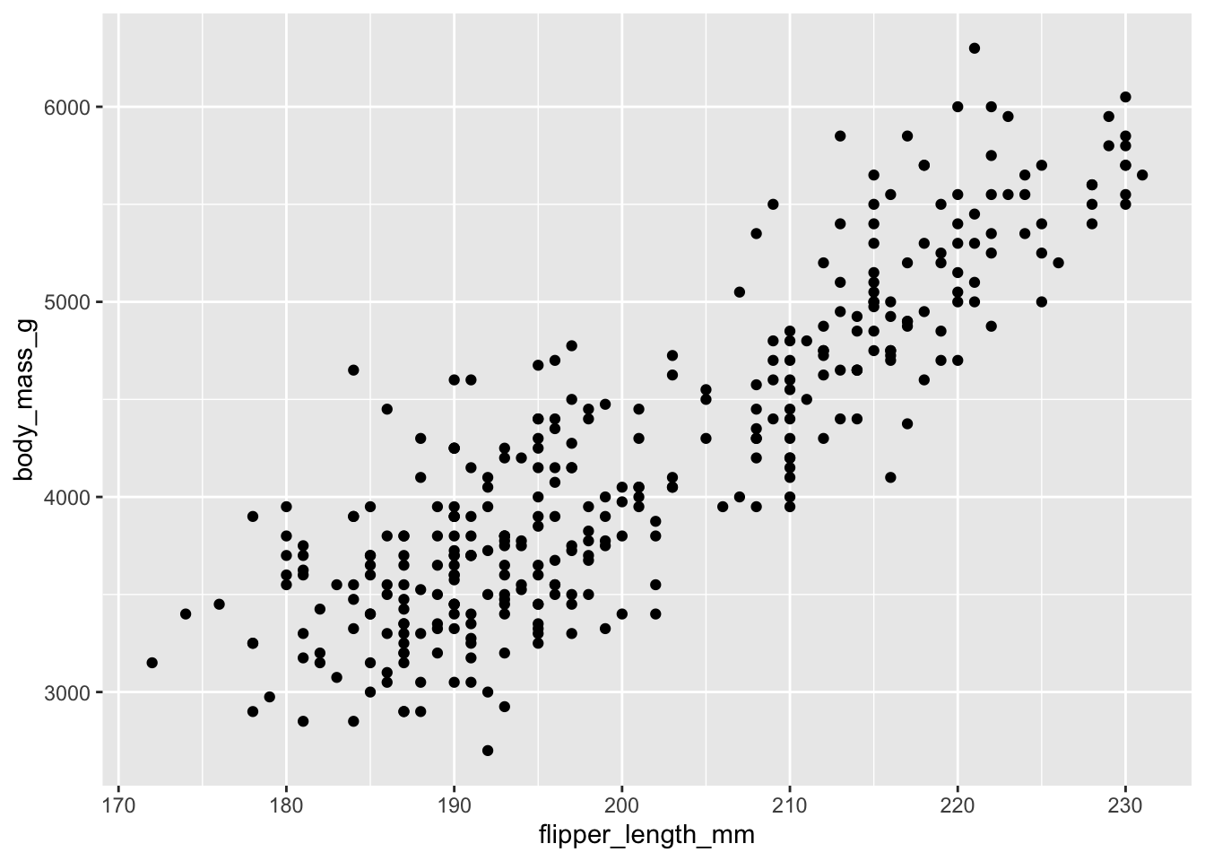
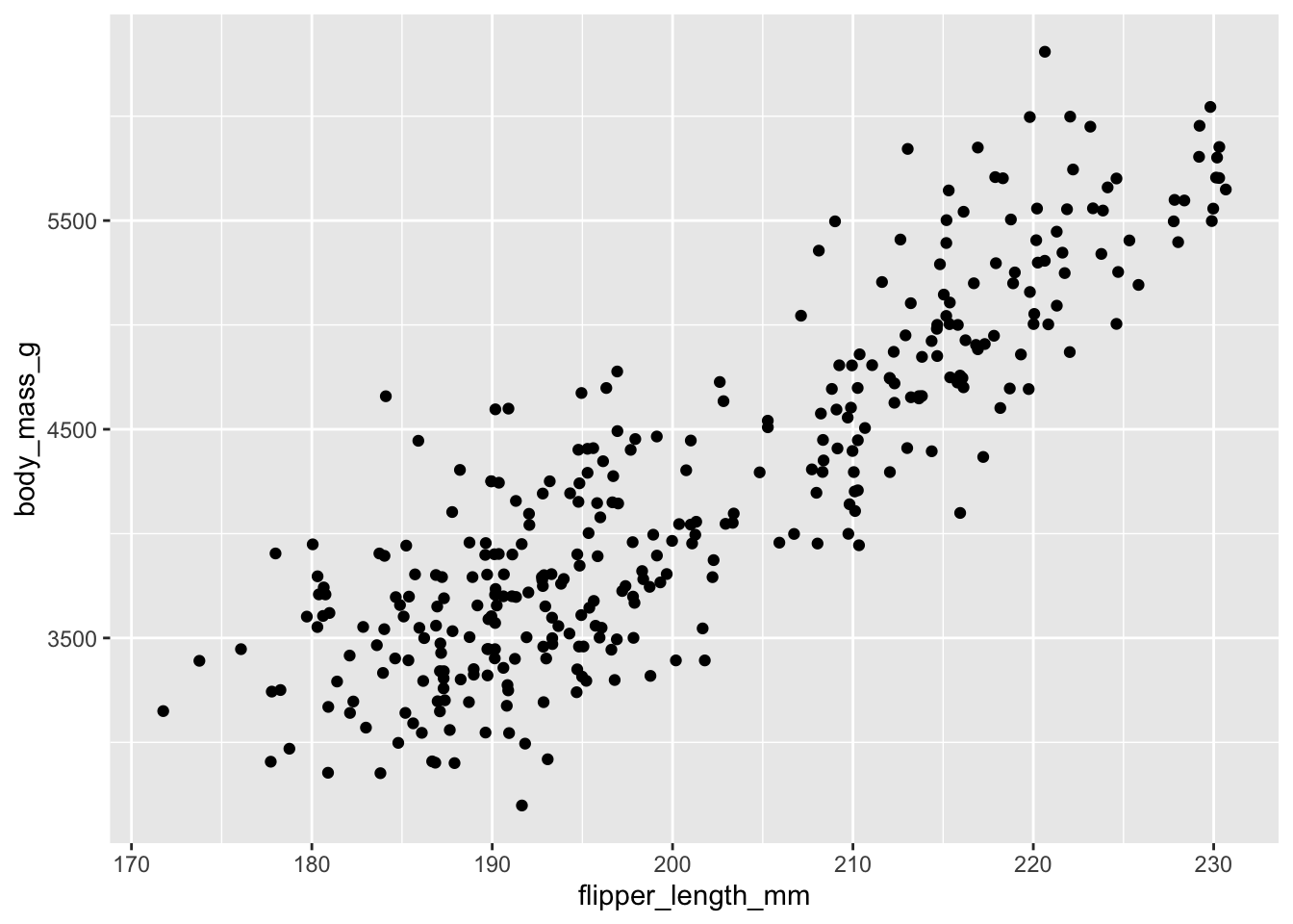
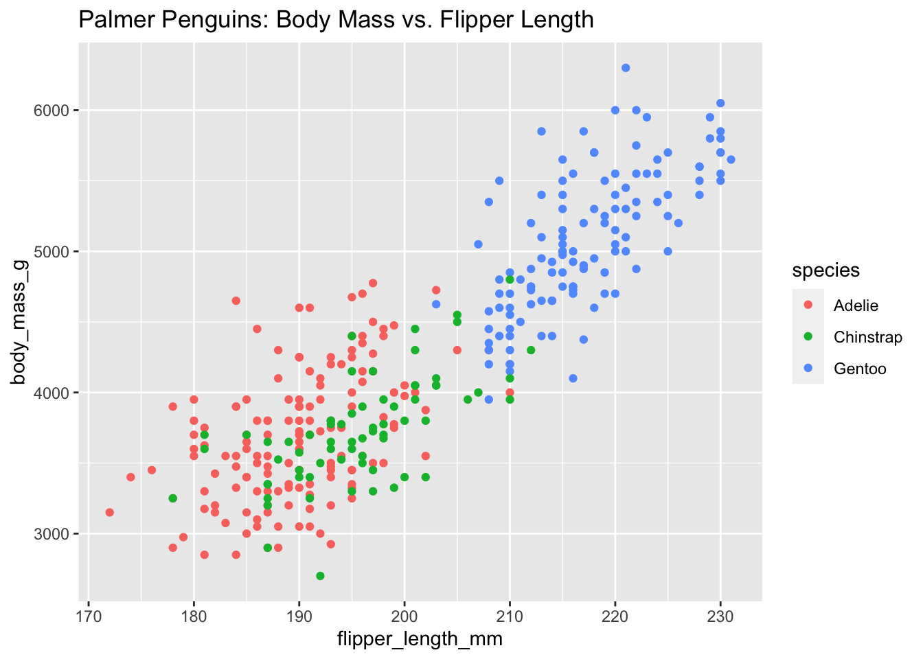
Create a basic scatter plot examining the relationship between flipper length and body mass.
ggplot(data = penguins) +
  geom_point(mapping = aes(x = flipper_length_mm, y = body_mass_g))

Basic scatter plot: Flipper length vs. Body mass
The same plot can be created with alternative syntax by placing the mapping in the ggplot() function:
ggplot(data = penguins, mapping = aes(x = flipper_length_mm, y = body_mass_g)) +
  geom_point()
Differentiate penguin species using different point shapes.
ggplot(data = penguins) +
  geom_point(mapping = aes(x = flipper_length_mm, y = body_mass_g, shape = species))
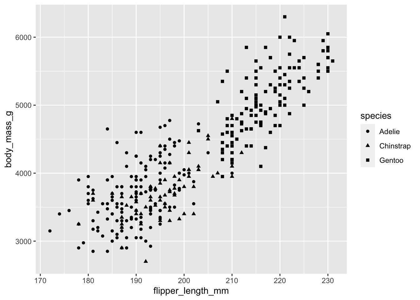
Species differentiated by point shape
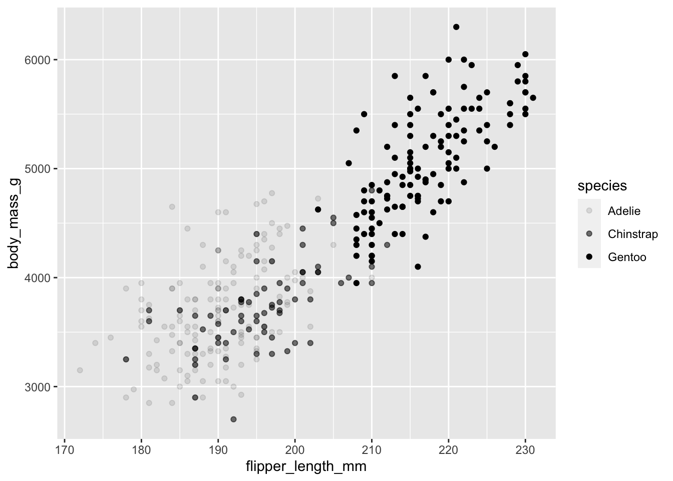
Enhance the visualization by adding both shape and color to distinguish species.
ggplot(data = penguins) +
  geom_point(mapping = aes(x = flipper_length_mm, y = body_mass_g, shape = species, color = species))
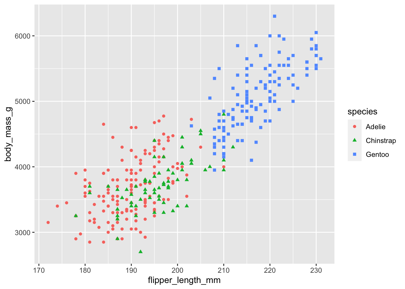
Species differentiated by both shape and color for improved clarity
Add size as an additional aesthetic dimension (note: this can make plots harder to read).
ggplot(data = penguins) +
  geom_point(mapping = aes(x = flipper_length_mm, y = body_mass_g, shape = species, color = species, size = species))
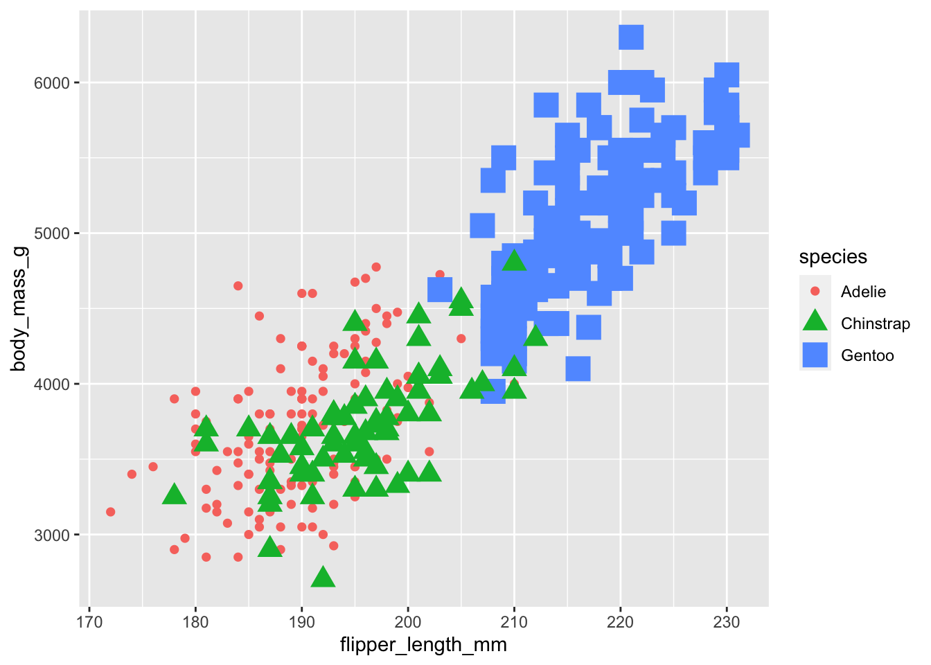
Multi-dimensional aesthetic mapping (shape, color, and size)
Use alpha (transparency) to distinguish between species groups.
ggplot(data = penguins) +
  geom_point(mapping = aes(x = flipper_length_mm, y = body_mass_g, alpha = species))
Species differentiated by opacity (alpha transparency)
Apply a uniform color to all data points (color specified outside the aes() function).
ggplot(data = penguins) +
  geom_point(mapping = aes(x = flipper_length_mm, y = body_mass_g), color = "purple")
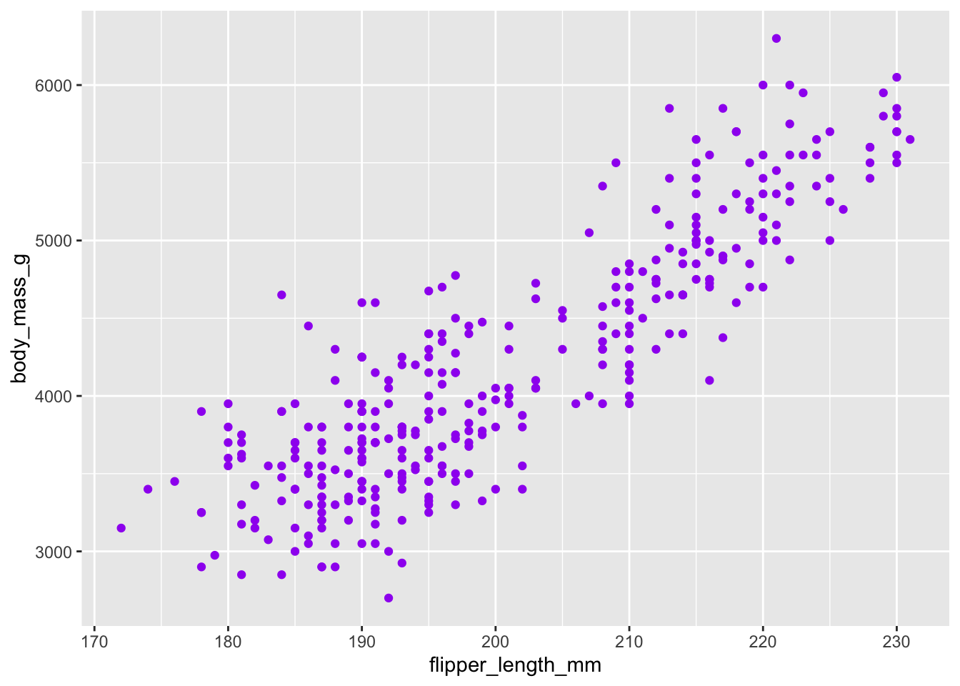
All points colored uniformly in purple
Use geom_smooth() to add a trend line to visualize the overall relationship.
ggplot(data = penguins) +
  geom_smooth(mapping = aes(x = flipper_length_mm, y = body_mass_g))
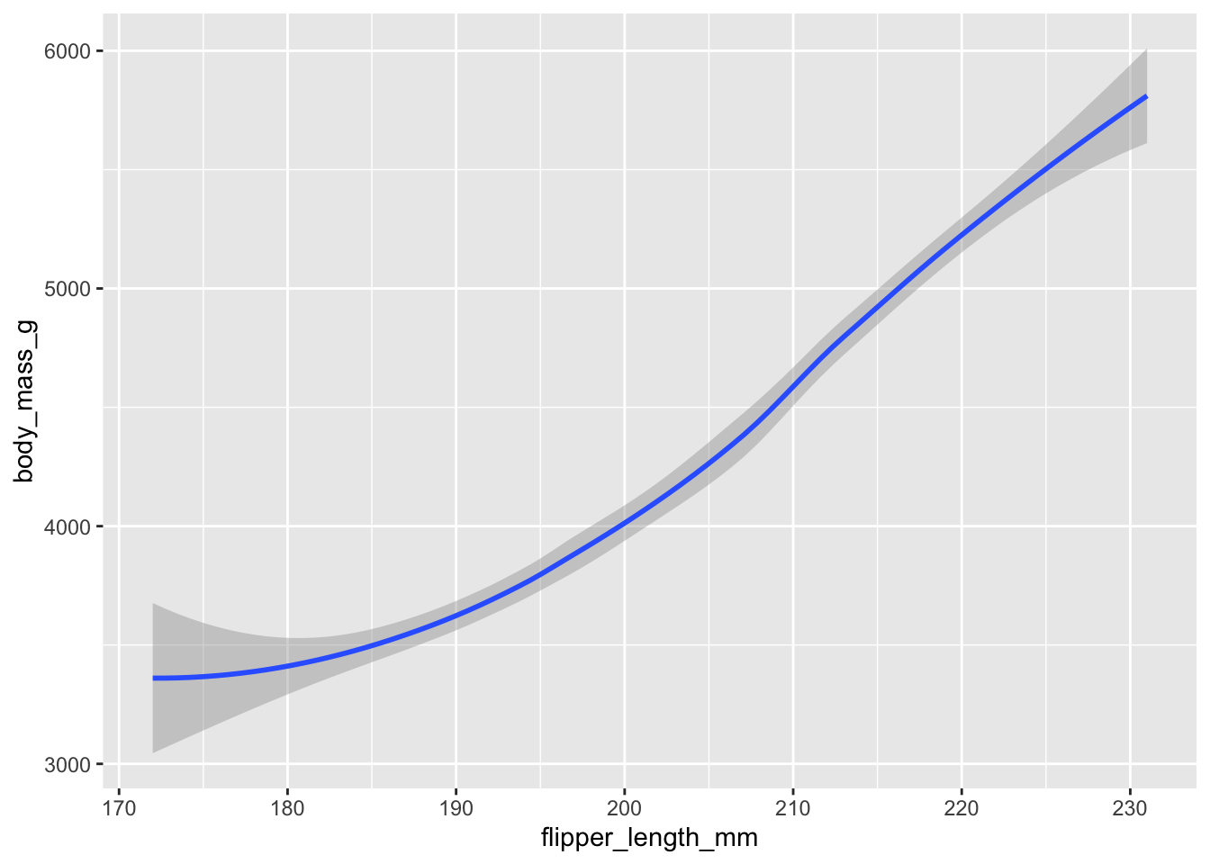
Smooth trend line showing the relationship between flipper length and body mass
Layer both geom_point() and geom_smooth() to show both data points and the trend line.
ggplot(data = penguins) +
  geom_point(mapping = aes(x = flipper_length_mm, y = body_mass_g)) +
  geom_smooth(mapping = aes(x = flipper_length_mm, y = body_mass_g))
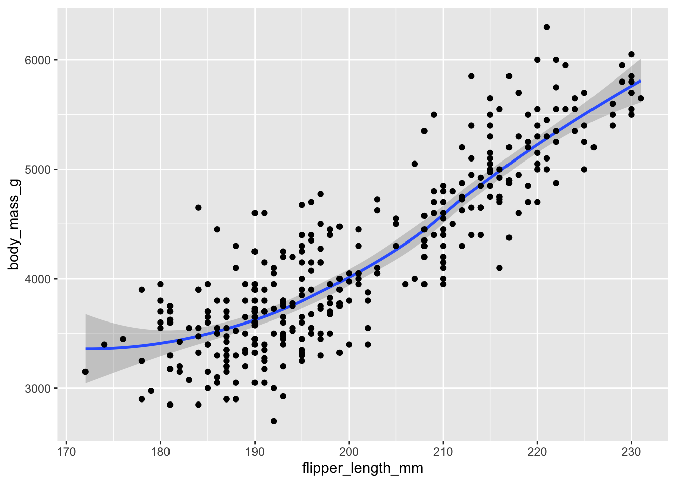
Combined visualization: scatter plot with overlaid smooth trend line
Create separate trend lines for each species using different line types.
ggplot(data = penguins) +
  geom_smooth(mapping = aes(x = flipper_length_mm, y = body_mass_g, linetype = species))
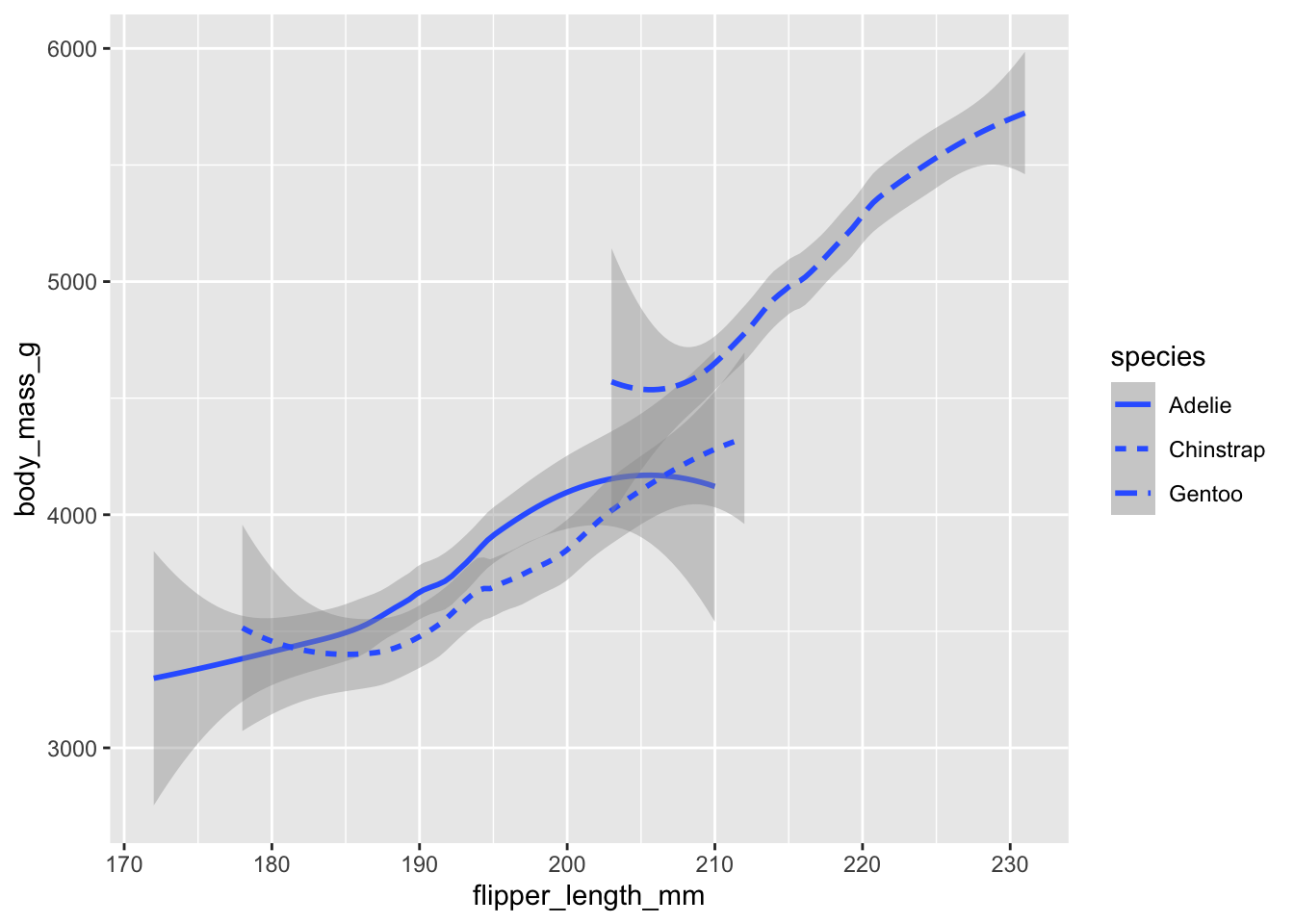
Species-specific trend lines differentiated by line type
Apply jittering to scatter plot points to prevent overlapping and reveal data density.
ggplot(data = penguins) +
  geom_jitter(mapping = aes(x = flipper_length_mm, y = body_mass_g))
Jittered scatter plot to reduce overplotting and show data density
Split the data into subsets based on sex and species using a grid layout.
ggplot(data = penguins) +
  geom_point(mapping = aes(x = flipper_length_mm, y = body_mass_g, color = species)) +
  facet_grid(sex ~ species)
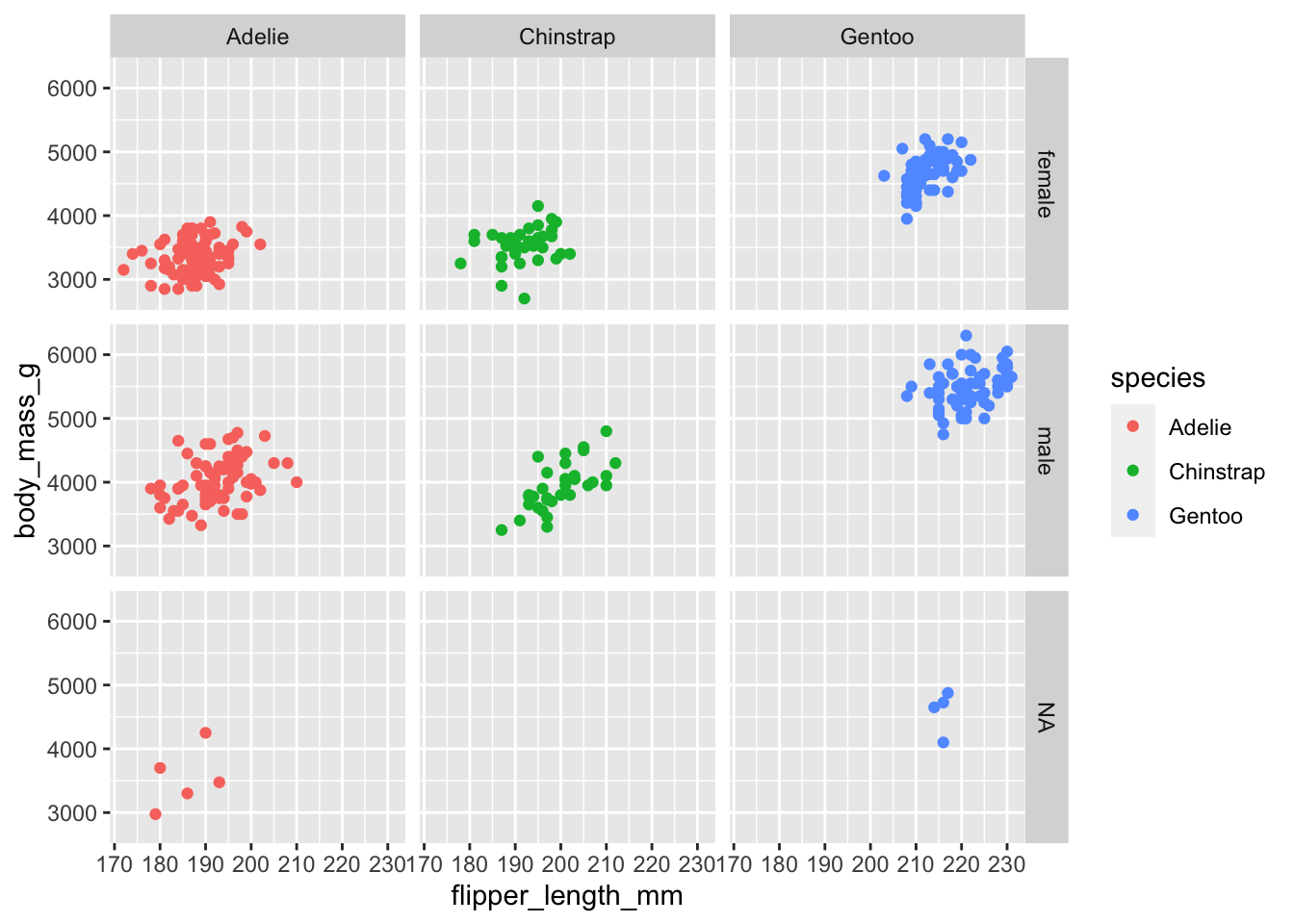
Faceted visualization: separate plots for each sex and species combination
Create separate plots for each species using a wrapped layout for better space utilization.
ggplot(data = penguins) +
  geom_point(mapping = aes(x = flipper_length_mm, y = body_mass_g, color = species)) +
  facet_wrap(~species)
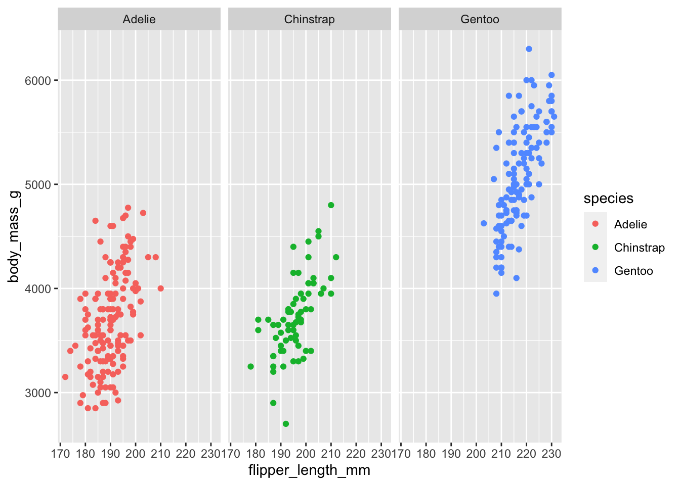
Facet wrap visualization: species-specific plots in a flexible layout
The diamonds dataset is included with ggplot2 and contains information on diamond characteristics.
data("diamonds")
View(diamonds)
Diamonds dataset structure and preview
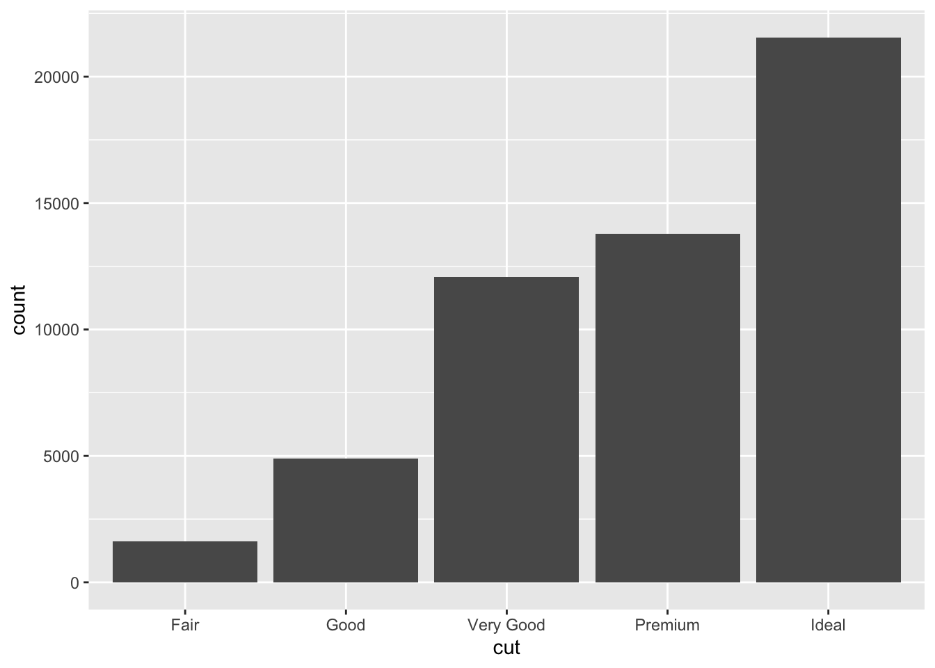
Visualize the distribution of diamond cuts using a bar graph.
ggplot(data = diamonds) +
  geom_bar(mapping = aes(x = cut))
Bar graph showing the count of diamonds by cut quality
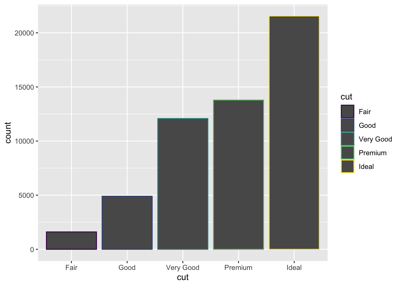
Use different colors for bar borders based on cut quality.
ggplot(data = diamonds) +
  geom_bar(mapping = aes(x = cut, color = cut))
Bar graph with cut quality differentiated by border color
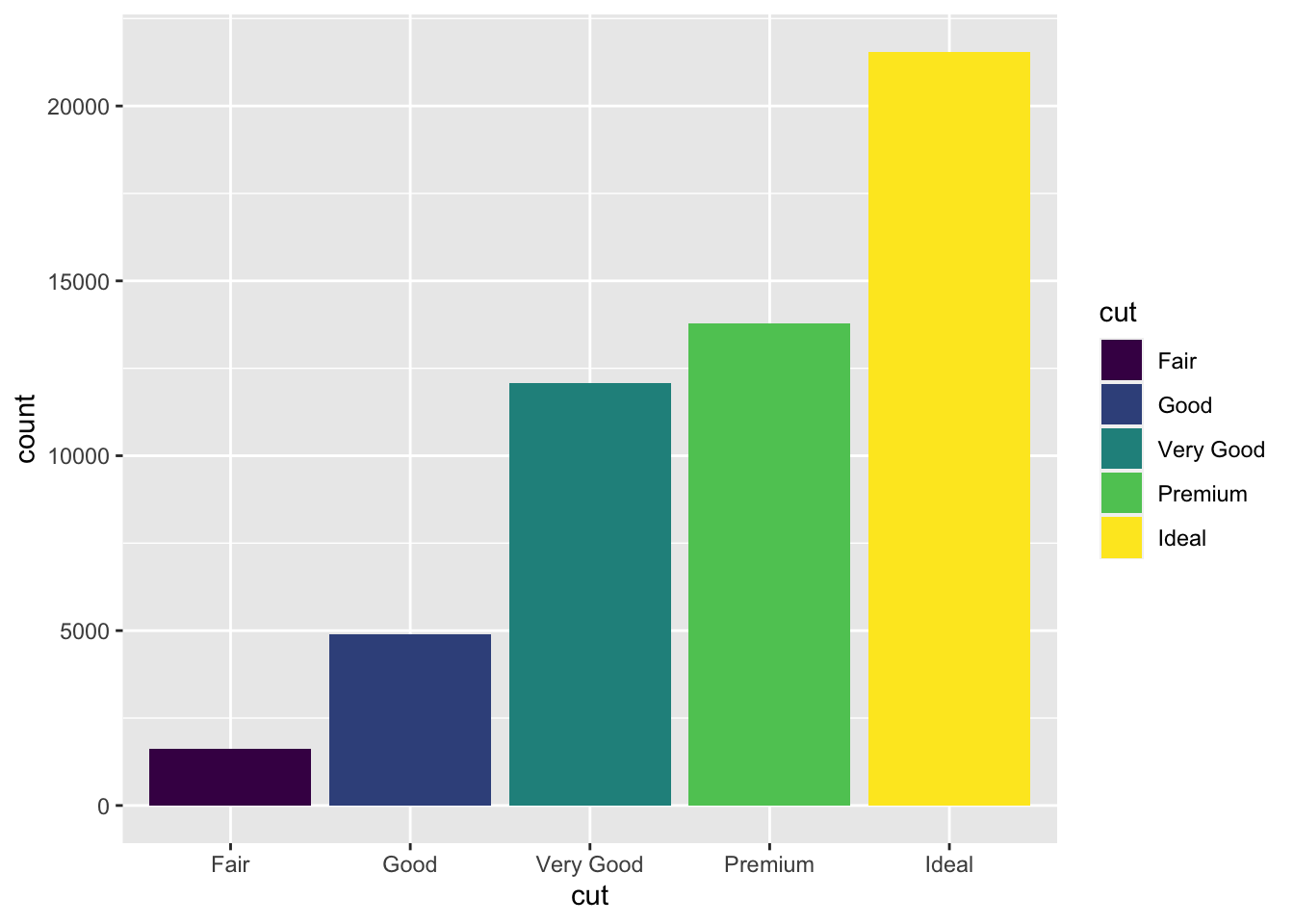
Apply different fill colors to bars based on cut quality for better visual distinction.
ggplot(data = diamonds) +
  geom_bar(mapping = aes(x = cut, fill = cut))
Bar graph with cut quality differentiated by fill color
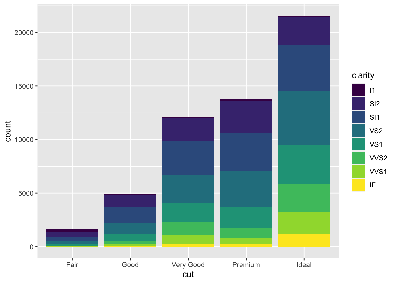
Show the distribution of clarity grades within each cut type using stacked bars.
ggplot(data = diamonds) +
  geom_bar(mapping = aes(x = cut, fill = clarity))
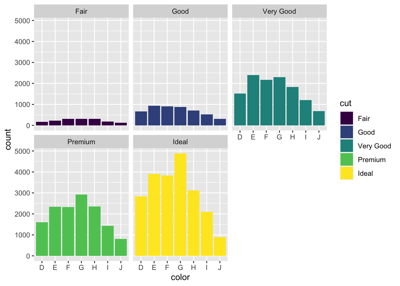
Stacked bar graph showing clarity distribution within each cut type
Create separate bar graphs for each cut type to better compare clarity distributions.
ggplot(data = diamonds) +
  geom_bar(mapping = aes(x = cut, fill = clarity)) +
  facet_wrap(~cut)
Faceted bar graphs: individual plots for each cut quality
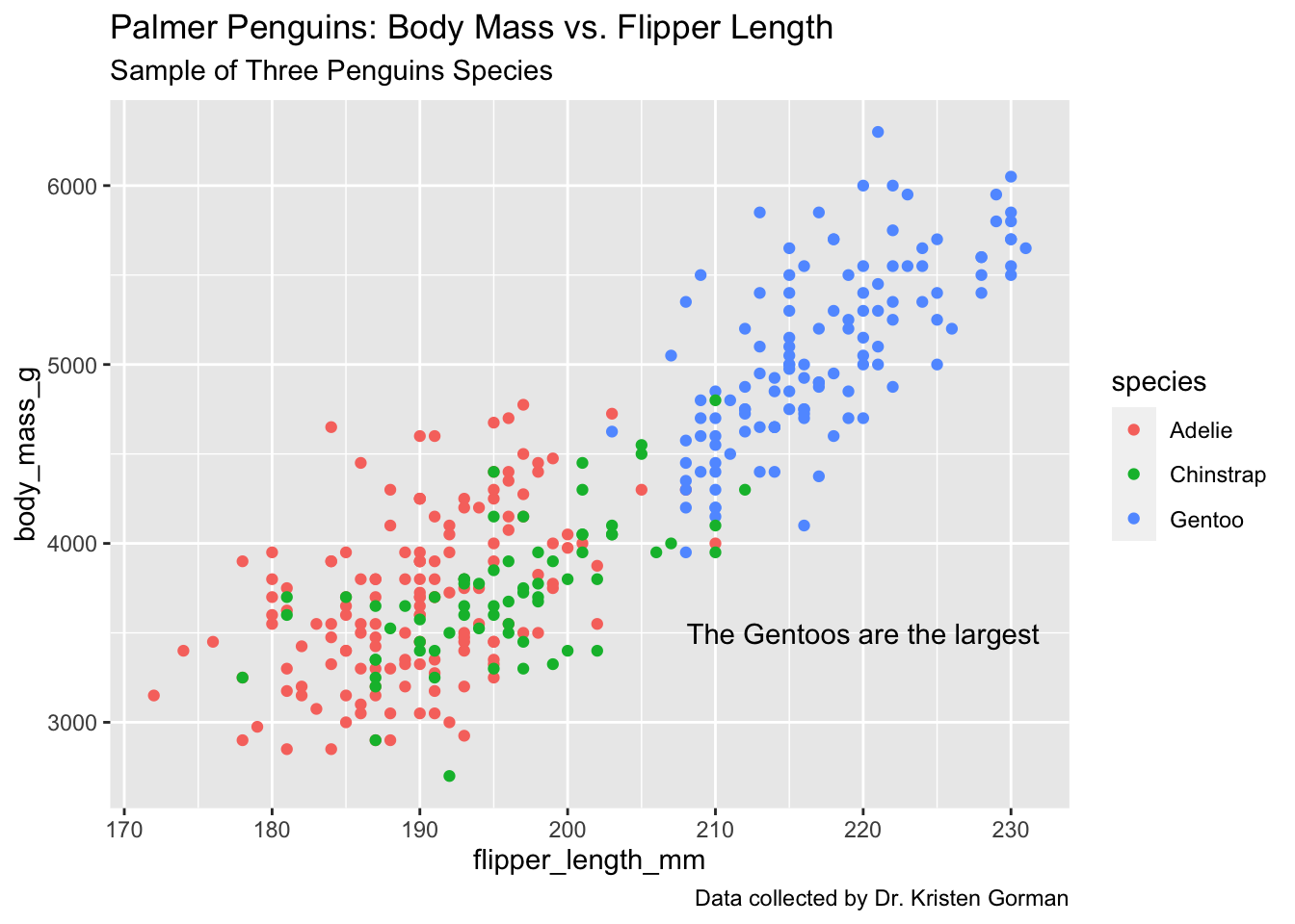
Add a descriptive title to your visualization using labs().
ggplot(data = penguins) +
  geom_point(mapping = aes(x = flipper_length_mm, y = body_mass_g, color = species)) +
  labs(title = "Palmer Penguins: Body Mass vs. Flipper Length")
Scatter plot enhanced with a descriptive title
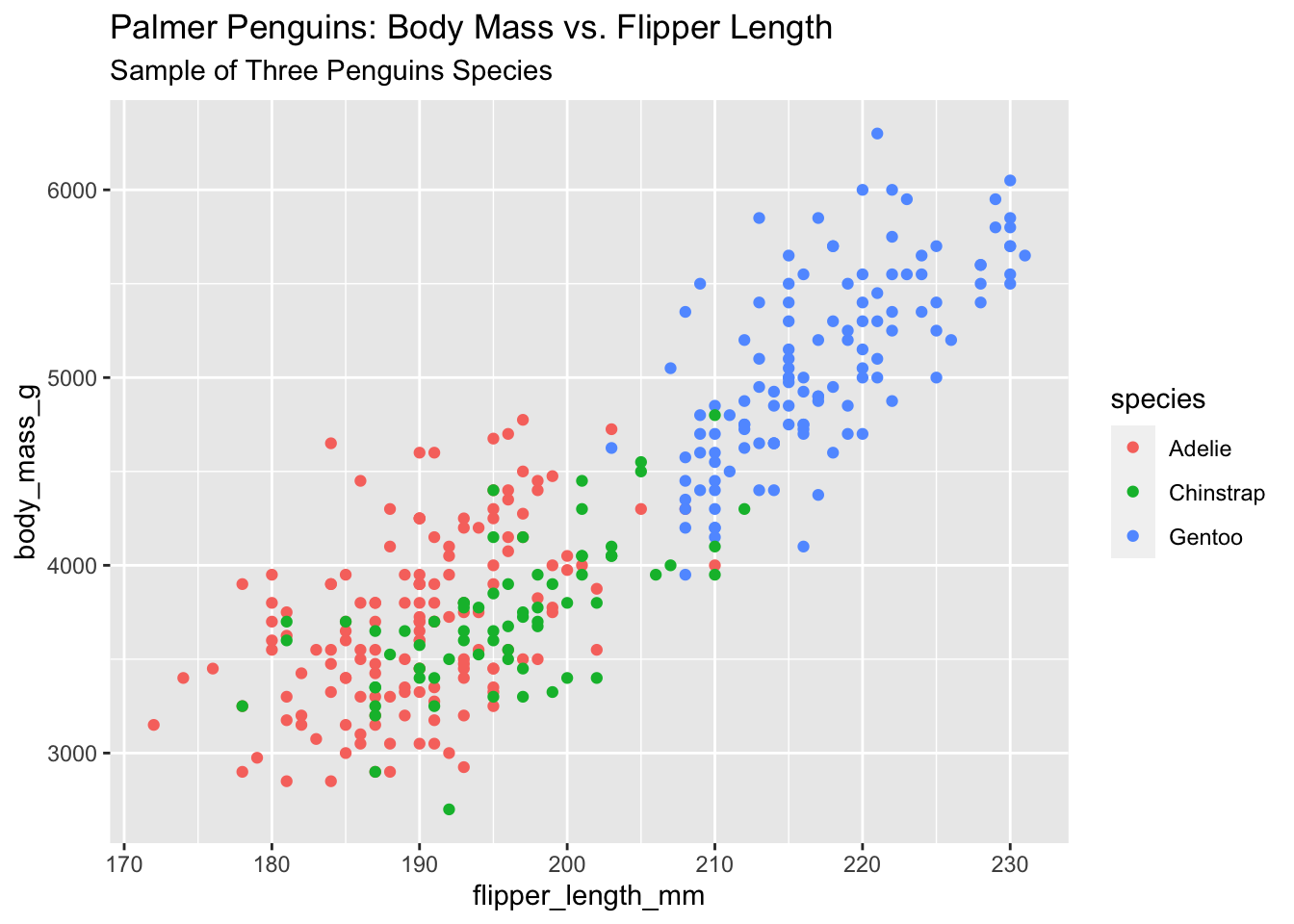
Include both a title and subtitle for additional context.
ggplot(data = penguins) +
  geom_point(mapping = aes(x = flipper_length_mm, y = body_mass_g, color = species)) +
  labs(title = "Palmer Penguins: Body Mass vs. Flipper Length",
       subtitle = "Sample of Three Penguin Species")
Visualization with title and subtitle for enhanced context
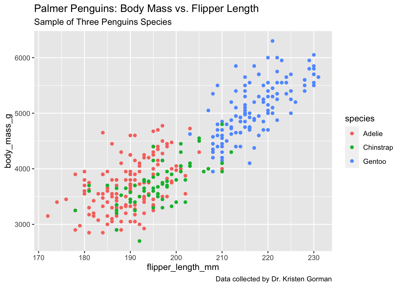
Include a caption to cite data sources or provide additional information.
ggplot(data = penguins) +
  geom_point(mapping = aes(x = flipper_length_mm, y = body_mass_g, color = species)) +
  labs(title = "Palmer Penguins: Body Mass vs. Flipper Length",
       subtitle = "Sample of Three Penguin Species",
       caption = "Data collected from 2007-2009")
Complete visualization with title, subtitle, and data source citation
Place custom text annotations directly on the plot using annotate().
ggplot(data = penguins) +
  geom_point(mapping = aes(x = flipper_length_mm, y = body_mass_g, color = species)) +
  labs(title = "Palmer Penguins: Body Mass vs. Flipper Length",
       subtitle = "Sample of Three Penguin Species",
       caption = "Data collected from 2007-2009") +
  annotate("text", x = 220, y = 3500, label = "Gentoo penguins are larger",
           color = "purple", fontface = "bold", angle = 25)
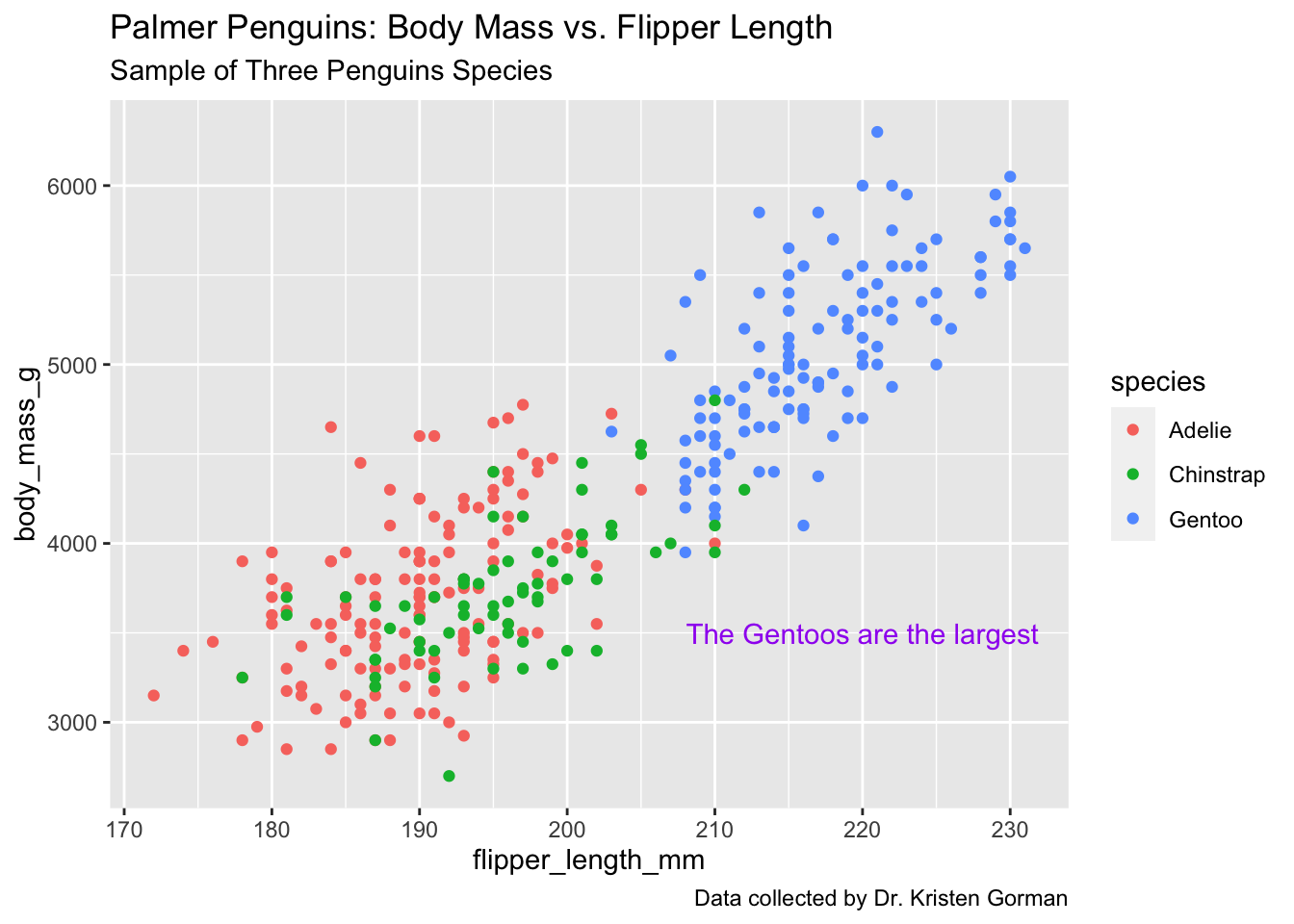
Publication-quality visualization with custom annotations highlighting key insights
Save your base plot as a variable to easily add different annotations or modifications without rewriting the entire code:
p <- ggplot(data = penguins) +
  geom_point(mapping = aes(x = flipper_length_mm, y = body_mass_g, color = species)) +
  labs(title = "Palmer Penguins: Body Mass vs. Flipper Length",
       subtitle = "Sample of Three Penguin Species",
       caption = "Data collected from 2007-2009")

# Then add annotations
p + annotate("text", x = 220, y = 3500,
             label = "Gentoo penguins are larger",
             color = "purple", fontface = "bold", angle = 25)
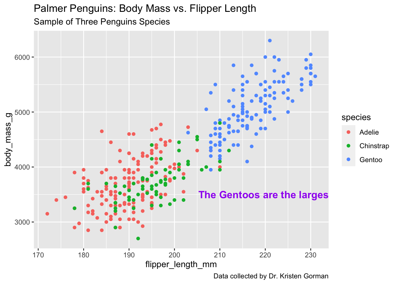
Final polished visualization demonstrating professional R visualization techniques
This comprehensive project demonstrates the flexibility and power of ggplot2 as a data visualization tool in R. Through systematic exploration of both the penguins and diamonds datasets, we've showcased the library's capabilities in creating publication-quality statistical graphics.
The techniques demonstrated, from basic scatter plots to complex faceted visualizations with custom annotations, represent essential skills for data scientists and analysts. ggplot2's grammar of graphics approach enables reproducible, elegant visualizations that effectively communicate insights from complex datasets.
These visualization techniques are fundamental to exploratory data analysis, statistical communication, and data-driven storytelling across diverse analytical domains including ecology, economics, and business intelligence.
Explore more data science projects demonstrating end-to-end analytical workflows and advanced visualization techniques.
Complete end-to-end data science project developing customer churn prediction models with advanced feature engineering and Random Forest optimization.
View Project
Interactive business intelligence platform built with Tableau for pandemic monitoring and epidemiological pattern analysis.
View Project